After 165 years of statehood, two of Minnesota’s state symbols are being replaced for a new generation.
Minnesota transitioned from being a territory to a state in 1858. Thirty-five years later, the first state flag was adopted in 1893. Minnesota’s first flag was designed by Amelia Hyde Center and featured the seal on a white field, framed by stars. In 1957 the flag was adapted and the white field was changed to royal blue, and the double-layered design was eliminated. Beginning in 1968, there was debate over the state’s seal and usage on the Minnesota flag. This was resolved in 1983, and Minnesotans were introduced to the third version of their state flag.
The Minnesota state seal was adapted by Minnesota’s first governor, Henry Sibley, shortly after Minnesota’s statehood. Sibley adapted the old Minnesota territorial seal and replaced the misinterpreted Latin motto “Quo sursum velo videre” (“I want to see what lies beyond”) with the French motto, “L’Etoile du Nord” (“The star of the North”). Sibley also reversed the image so the sun was setting in the west instead of rising in the east, and placed the words “The Great Seal of the State of Minnesota 1858” around the design. Much symbolism went into the design, according to the Minnesota Secretary of State’s guide to state symbols. The sun represented the flat plains of the state, and the cultivated ground and plow symbolized agriculture. The Mississippi River and St. Anthony Falls are included in the design to note “the importance of Minnesota’s natural resources for trade and commerce.” The three pine trees represent Minnesota’s state tree, the Red (Norway pine), as well the three main pine regions of the state. The tree stump recognizes Minnesota’s timber industry; the Native American represents the Native heritage of Minnesota; and the horse, spear, axe, and rifle represent important tools used for hunting and labor.
In 1989, a citizen’s coalition began to campaign for a new state flag. Two hearings were held in the House Governmental Operations Committee, but the study did not continue. The designer of the Canadian flag endorsed the proposal for a new flag, as did state newspaper editors. In 2001, the North American Vexillological Association published a survey in which Minnesota’s state flag was ranked as one of the ten worst flag designs in the United States and Canada. The survey judged flag designs based upon their visibility at a distance and effective use of patterns and symbols. More proposals were brought forward for a new flag between the years 2000-2007, and in 2018 a pair of bills called for a team to study the design of the current flag.
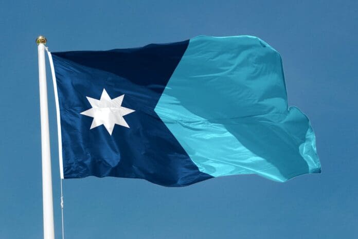
Now a new flag has been selected for Minnesota, pending some final design decisions. The flag has an eight-pointed North Star atop what MPR called a “blocky figure of Minnesota”. It was designed by Luverne resident Andrew Prekker. Prekker cites inspiration from other state flags such as Arizona, Texas, New Mexico, and Colorado.
The state seal will also be redesigned. It will feature a loon (Minnesota’s state bird) as the focal point, flanked by wild rice (Minnesota’s official grain) and pine trees, with the North Star in the sky. The motto on the seal will be changed to the Dakota “Mni Sota Makoce” (“Land where the waters reflect the clouds”) The design was submitted by Ross Bruggink of Shorewood.
Merry Christmas, Minnesota! You’re getting new state symbols to ring in the New Year.


